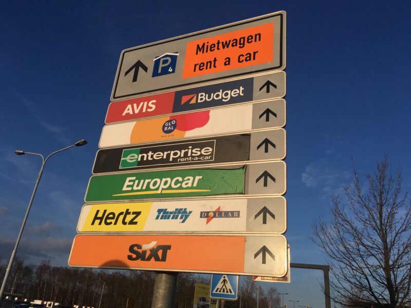
A sign at Airport Schönefeld featuring ‘all’ the rental car players: Sixt, Hertz, Europcar, Avis etc. To me the the sign looks a bit – wierd. Is it really necessary to feature each and every company with its own logo? Shouldn’t it be enogh to point out, where to find a rental car? And also: i really like how the “P” was ‘repeaired’ with this little white angle on top of the “P” so that it suggests you’ll find the rental car stations inside a parking house.
